Uploaded by Mildgyth 


.")


 - Took part in the 2020 Community Collab")


 - Celebrated Derpibooru's seventh year anniversary with friends")


 - Celebrated Derpibooru's six year anniversary with friends.")


")
")

1280x1710 JPG 169 kB
Interested in advertising on Derpibooru? Click here for information!

Help fund the $15 daily operational cost of Derpibooru - support us financially!
Description
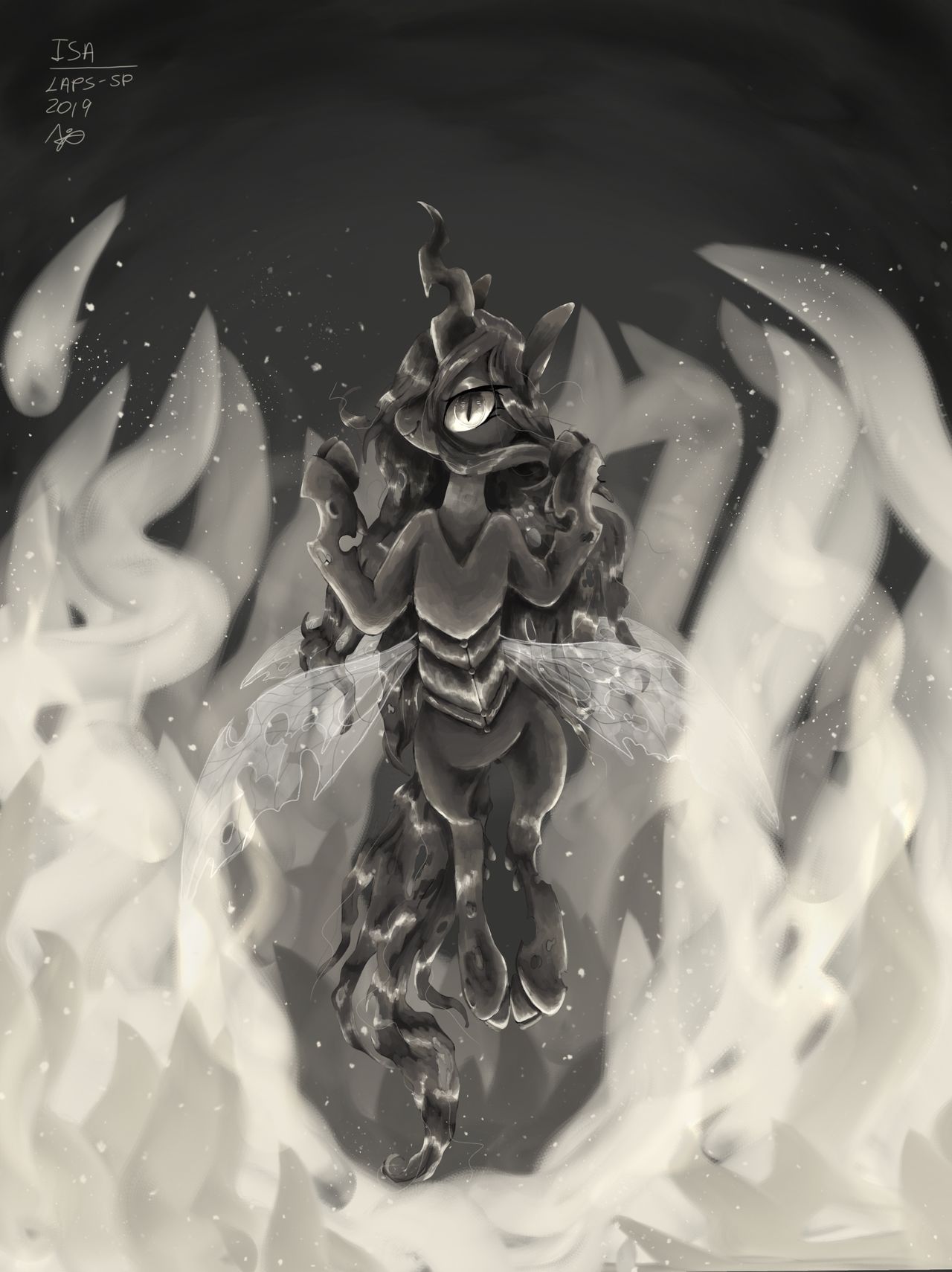
Hello! My entry for the ‘Evildoers’ contest organized by EStories , and for the lack of a better idea (but with an inspiration spark) I drew Chrysalis, which was something I had only done once or twice, and I already rarely draw canon ponies outside of fandom projects, so this was a nice change.
I’m trying something a bit different with this piece. Usually when I do paintings, the rendering is super smooth, and you can barely see any brushstrokes, but that wasn’t the original purpose. What I originally wanted was that you could see the brushstrokes I wanted lots of texture, and because I rendered so much, I did have a lot of texture over all; skin, whool, fur, hair, wood, they all had the exact same texture, and that bothered me (plus the super smooth rendering take me INCREDIBLY LONG)
With this here piece I tried to loosen up the brushstrokes and get more texture, and I certainly had a bit more fun with it than I would’ve if I had chosen to do the smooth rendering, and even if this had a monochromatic pallet, I didn’t feel bored quite as much.
But, I still am unsure if I should stick to this looser style or keep up with the super nice rendering.
Twitter: twitter.com/LapsSp?s=09
Instagram: www.instagram.com/laps_sp/
youtu.be/n7G8whZt0wA
Comments
0 comments posted