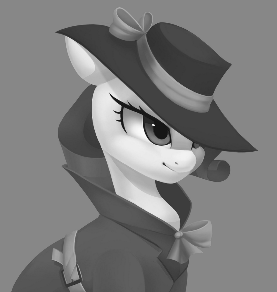
Introducing a New Design

Shadow Star
Silly Pony - Celebrated the 13th anniversary of MLP:FIM, and 40 years of MLP!
Lunar Supporter - Helped forge New Lunar Republic's freedom in the face of the Solar Empire's oppressive tyrannical regime (April Fools 2023).
Princess of Love - Extra special version for those who participated in the Canterlot Wedding 10th anniversary event
Artist -
Non-Fungible Trixie -
Kinship Through Differences - Celebrated the 11th anniversary of MLP:FIM!
Preenhub - We all know what you were up to this evening~
Ten years of changes - Celebrated the 10th anniversary of MLP:FiM!
My Little Pony - 1992 Edition
Equality - In our state, we do not stand out.

@joedeeloo  
I don’t think its stretched looks more like a placement/size issue as the Anonopony one does it.  
like the posts in this thread.
 
spoiler filter option bar, not general filter(s)
Background Pony #F604
I like the new layout, getting more images in a screen is convenient. My one gripe is that when I search images with spoiler: they remain spoiled, but before it caused the displayed images to be unspoiled. If I select spoiler:, I want them unspoiled, and having it automatically do that is a missed feature I would be quite happy to have returned.
Elwarrr

Liked the old style more. This one ain’t bad but it’s different enough that it makes for some awful surprise and feelings of “That shouldn’t be like this!”.
 
There’s no reason to fix what isn’t broken - the old style was good. If you want to have the new one, at least give the users the ability to have the old one display still.
GyroTech
Blitz - For supporting the site
Piaow!! - Derpi Supporter
My Little Pony - 1992 Edition
Friendship, Art, and Magic (2020) - Took part in the 2020 Community Collab
The Magic of Friendship Grows - For helping others attend the 2020 Community Collab
Bronze Bit -
Emerald -
Toola Roola - For helping others attend the 2019 Community Collab
Friendship, Art, and Magic (2019) - Celebrated Derpibooru's seventh year anniversary with friends.
A Tale For The Ages - Celebrated MLP's 35th Anniversary and FiM's 8th Anniversary

The Prettiest Catbird
I hate this trend of buttons that blend into one another that seems to be popping up everywhere. Other than that it’s fine, but please cab we get bordered buttons back. It makes things look more click able for one.
Background Pony #D421
Buttons aren’t moved around and it looks more open without all the border boxes. Been here for four years so I’m pretty glad it doesn’t feel like a different site, as some ui updates tend to do.  
10/10  
Still don’t plan on making an account muahahahaha can’t tie me down
evilpresident
Not a Llama - Happy April Fools Day!
The End wasn't The End - Found a new home after the great exodus of 2012

Honest corruption
EVERYTHING IS DIFFERENT AND I HATE IT!!!
 
But in all seriousness, I like the new look. Looks pretty sleek and neat. The only thing I can ‘complain’ about is that some people’s avatars seem to move a bit to the right and obscure their posts.
Delete_Everything

Gonna be honest here, the lack of borders kinda makes it look a bit messy. I don’t know, could just be me with a slight case of ocd but other than that I don’t really see anything wrong with the new layout. Just surprising is all.
kleptomage
Pixel Perfection - I still call her Lightning Bolt
Lunar Guardian - Earned a place among the ranks of the most loyal New Lunar Republic soldiers (April Fools 2023).
Magnificent Metadata Maniac - #1 Assistant
Perfect Pony Plot Provider - 10+ uploads with over 350 upvotes or more (Questionable/Explicit)
The End wasn't The End - Found a new home after the great exodus of 2012
Fine Arts - Two hundred uploads with a score of over a hundred (Safe/Suggestive)

I’m going to try out the dark theme for a while. It’s easier on the eyes.
 
I’d like if the current page number in threads was underlined or otherwise highlighted so I could read it easier at a glance.
 
There is space for another image or two in the recent uploads and recent favorites on user profiles.
 
I don’t mind the notification text being downsized to match the rest of the site but the image thumbnails in notifications are sized for ants. They should be avatar size at least.
 
Bring back the exact date a user joined or add the exact date on a tooltip. Speaking of which, could the accuracy of all the time stamps be improved? I’ve seen them off by a month or more in some cases.
 
It would be nice if character tags had their own color like the artist and rating tags.
JP
Pixel Perfection - I still call her Lightning Bolt
Silly Pony - Celebrated the 13th anniversary of MLP:FIM, and 40 years of MLP!
Shimmering Smile - Celebrated the 10th anniversary of Equestria Girls!
Solar Guardian - Refused to surrender in the face of the Lunar rebellion and showed utmost loyalty to the Solar Empire (April Fools 2023).
Roseluck - Had their OC in the 2023 Derpibooru Collab.
King Sombra - Celebrated the 10th anniversary of The Crystal Empire!
A Lovely Nightmare Night - Celebrated the 12th anniversary of MLP:FIM!
Princess of Love - Extra special version for those who participated in the Canterlot Wedding 10th anniversary event by contributing art.
Elements of Harmony - Had an OC in the 2022 Community Collab
Non-Fungible Trixie -

I miss the show so much
After using the new theme for three hours, I’m joining the “needs more borders” choir. The borderless buttons are a bit annoying. Also, could the background color (in the light theme) be fully white? It’d help with contrast. It’s not a big difference from what it is now (#f8fafc), but it’s big enough.
Interested in advertising on Derpibooru? Click here for information!
Ministry of Image - Fanfiction Printing

Help fund the $15 daily operational cost of Derpibooru - support us financially!

This topic has been locked to new posts from non-moderators.

Locked

Lock reason: old thread