Uploaded by cutiesparke .")

659x330 00:01.26 GIF 829 kB
Interested in advertising on Derpibooru? Click here for information!
Help fund the $15 daily operational cost of Derpibooru - support us financially!
Description
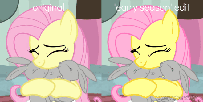
i realized what bothered me so much about later seasons. desaturated colors and smaller irises/eyes!
so i did a quick edit to see what it’d look like in my preferred style :) it’s a little messy but i like it.
so i did a quick edit to see what it’d look like in my preferred style :) it’s a little messy but i like it.
Source
not provided yet
yay, that’s rly rly cool, and um, whichever you prefer
Edited
i made it ^^ the original or the edit do u want?
their eyes arent allowed to be big and cute anymore- a lot of idle expressions are usually really small irises, oddly
it’s nothing against the show itself, i just lost interest along the way, and these are only some of the reasons why ^^;
But the smaller eyes/irises, well… it’s just not that noticeable. I watched this GIF for a couple minutes and can see the differences, but it’s not a big enough difference for me to care.
Did this really keep you from enjoying the later seasons of the show?
Basically anything broadcast in the United States also needs to be color-corrected to be “broadcast-safe” – i.e. you can’t have overly-saturated colors since really bright whites and dark blacks would cause compression artifacting in a digital broadcast, and would even start to screw with an analog broadcast (bright whites distort audio, dark blacks roll the picture).
I think so too. I’ve always noticed early screencaps of episodes ripped from people’s TVs and streams are always a lot more saturated than the screencaps from official releases.
Edited