
Interested in advertising on Derpibooru? Click here for information!
Help fund the $15 daily operational cost of Derpibooru - support us financially!
Description
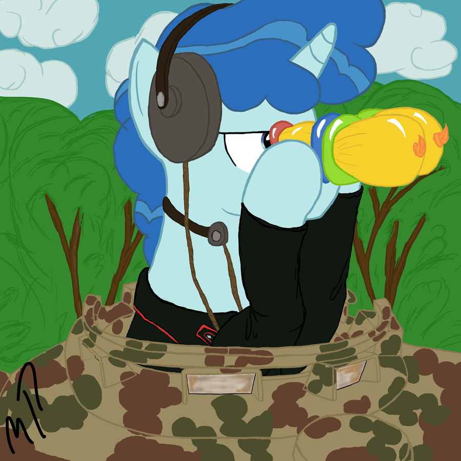
Oberpanzerschtze party Favour. DA won’t allow me to use the proper “” in the title so I’ll just write it here “cuz I can”
Sometimes it’s good to do something you don’t normally do just to remind you why you don’t do it. And that’s the story behind my attempt at the true-to-show style.
Still think there’s something weird with the background Bocage colour… not sure what to do about it.
Sometimes it’s good to do something you don’t normally do just to remind you why you don’t do it. And that’s the story behind my attempt at the true-to-show style.
Still think there’s something weird with the background Bocage colour… not sure what to do about it.
Wow. Someone with a DeviantArt account should post this where the artist could read it.
The color you are using looks close to #20c020, if you’re using hexadecimal color codes. #669900 and #646c48 would look more natural and more appropriate.
Also, from a color-theory and composition perspective, bright colors draw the eye and make the brain say “this is the center of attention, this is what the picture is about.” Dim the bocage, dull it, darken it, fade it out. The mare and the tank turret hatch are the subject. Bring the eye to them, make them the focus.
Secondarily, and this begins to get into areas of how complex you want to make the background, trees and brush aren’t a flat two-dimensional green wall. They’re three-dimensional objects with highlights, shading, and shadow, even when they’re so far into the distance that you only perceive them as a green sphere or cone on a dark stick coming out of the ground.
Disclaimer: this advice is worth what you paid for it.
https://www.youtube.com/watch?v=J-wS5xviDvs