@Clover the Clever
I think in this current overreactive mood I can’t look like anything but a bad guy, but yes I knew from the beginning that you’d be trying things for days and just wanted to throw in a casual word of praise. Don’t group me with the troublemakers please.
I wanted to give more detailed feedback yesterday but it seemed things became tense, didn’t want to add extra weight, but I’ll risk it.
UPLOAD PAGE:
This looks rather uncomfortable.

There is not actually anything I’d want to see in the background other than whiteness, so I don’t really know why transparency may be neccessary. On the other hoof, light blue on white (and sometimes blue as shown here) is more difficult to read.
LAYOUT:
Wanna explain how I used thesite before.
I was able to make 100+ uploads this last weekend and could monitor them for comments for days afterwards because the ‘Booru made it easy for me to.
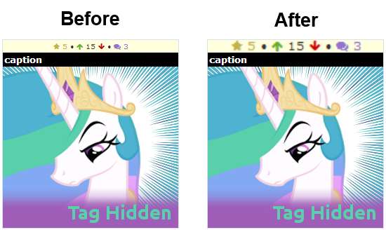
See, when I click My Uploads (or the DB front page) and I get something like this
>>359420
The image score is on the far left. The comment score is on the far right. Because it’s black-on-light blue both are quite visible to the eye, and because of the positioning, they are very easy to follow even I compare them on two pictures. May not be perfect but it works.
So what I could do was to bring up My Uploads, scroll down quick (I have my images/page set to 50 atm - that’s ten rows) and still immediately see if any of the scores have increased, if there were any new comments (as long as I remember yesterday’s numbers) and where the images are in score/popularity relative to each other. It was very easy for the brain to quickly absorb that one number from each pic and compare them.
Now when I bring up My Uploads and see something like this:
link
I can not do this anymore because of these reasons:
- The comment counter, purple on a blue background, is more difficult to see altogether. (Similar problem with fave yellow but that doesn’t interest me mch actually.)
-The three counters are very close to each other so each distracts from the other two when you are trying to compare the scores on images next to each other.
As a result I’m more inclined to give up my habit of keeping a check on my uploads (I usually follow it for a few days whether they had tag changes, comments, votes) because I can not absorb the page in one quick look that only takes a few seconds.
Now I just want to make it clear, not everyone may use it like that, and I personally do not mind either because I have been spending more time here than what’s healthy for the past few days anyway, so anything that makes things more complicated for me is a net gain for my IRL job and classes. :D
I just wanted to let you know how someone like me may be using the site in case it has some useful info about how others may be using the site.
@Keith Mowz
The buttons aren’t going to get bigger, unless you want them to remove the downvote from thumbnail function again.
There is actually more room in this setup, you can go check the All Time Top Scoring lists.


 - Took part in the 2020 Community Collab")

 - Celebrated Derpibooru's seventh year anniversary with friends.")

 - Celebrated Derpibooru's six year anniversary with friends.")


 - Celebrated Derpibooru's five year anniversary with friends.")


