Posts

For more information, see the search syntax documentation. Search results are sorted by creation date.

Search Results

Site and Policy » Site Development Notification and Feedback Thread » Post 1049

Garden Tinker
Wallet After Summer Sale -
Artist -

…Well, now I feel a bit silly for giving such a rabid review, after going back and reading some things from a couple of pages ago.
Also, to put everyone at ease, the vast majority of actual layout changes will be focused on mobile. The layout will remain largely the same on desktop, with only minor incidental changes. What will change on desktop would be appearance, things may be moved a few pixels here and there, because we’ll be moving to using rem as our primary measurement unit instead of px, and ensuring that all spacing is incredibly consistent.
and @Luna’s
They will be all rounded, the redesigned design language is all about rounded corners (there will be an option to disable rounding).
 
Also, I swear I am not @Moonlight Bloom in disguise. Though it seems I sincerely appreciate a number of their opinions…
…And, okay, maybe a little of this, too…

Site and Policy » Site Development Notification and Feedback Thread » Post 1048

Garden Tinker
Wallet After Summer Sale -
Artist -

A vote for the search field size remaining as-is, or else the expansion effect being a user-toggleable option. I like it small and cozy.
I also have a 1280px-width monitor, so it wouldn’t even double the size of the field for me, so I’d be one of those getting the least benefit out of it.
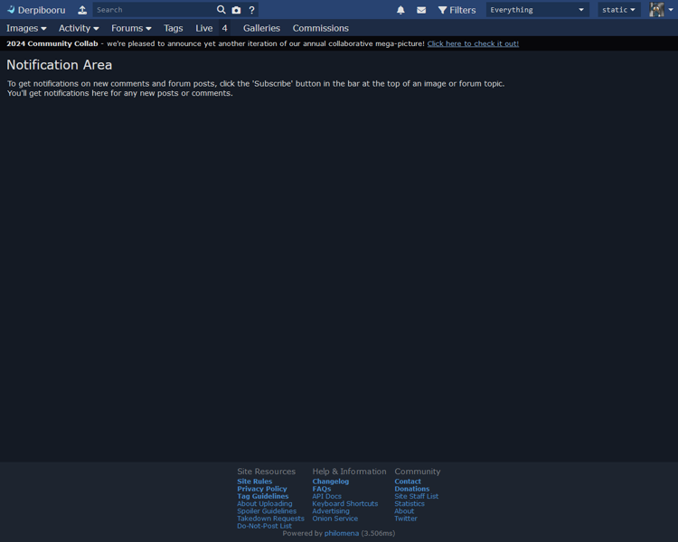
I’m also not sure if the images beside the buttons for Images, Activity, etc. are specifically intended to bring more attention to them, but they feel very unnecessary. As it is, the words alone run about half my screen width, which feels like more than enough.
The little grey bars underneath the drop-downs (for filters and spoilers) beside the profile picture, perhaps specifically in addition to the rounded corners on the drop-downs, make the drop-downs feel pinched in addition to rounded. That bar really blends into the button itself and almost makes it look like the bottom of the button has a downward bow/curve. Which in turn makes my eyes want to interpret the top as having a similar effect, insofar as seeing the top corners begin rounding off much quicker than they actually do, altogether creating something like an oval with flat left and right sides. (Something that’s probably particularly easy for my brain to believe due to having played around with CSS, having made elements look that way while fiddling with things at some point.)
As @BP#1057 mentions, far too much vertical padding in the top area as well. If I’m doing my rescaling correctly, the new design’s entire header as a whole takes up exactly as much vertical space as the current header plus the notification bar’s vertical space.
Also, the way the profile… bubble? sticks out above and below the vertical reaches of the nearby drop-downs is cute and witty in its own right, and honestly does look good in this example, but I just can’t get behind it as a change. Not if it helps provoke the additional vertical padding/whitespace.
Now, these next two I’m going to mention tenuously, as I can’t tell if they’re intentionally part of the redesign, or if they’re simply a byproduct of generating the preview:
I really don’t like the concept of making the topmost bar the same color as the background, such that the bar beneath it just cuts through the continuous color and sticks out like some sort of lone ribbon strand. More specifically, I really hope we get to keep the topmost bar being the nice shade of solid blue that some of us - or at least I - have come to associate with the site.
I also really hope that the site will continue to proudly state its name as Derpibooru and that we’ll continue to have Trixie’s cutiemark as the icon, of course.
  (That being said, the icon for Philomena does look pretty nice!)
And please, please don’t go to the abhorrent circular profile picture concept that everywhere else has gone to. It doesn’t look better than the square version. It never has. All it does is elbow-in more whitespace where there previously wasn’t and artificially limit avatars by making a lot of otherwise fine images look wonky and/or bad because of the forced rounding cutaway. Plus, for users that really want their avatar to be a circle, it’s not at all difficult to modify an image into that fashion manually.
  (Although… While using a placeholder BGP# image, I can’t deny that it looks adorable. Like a little pony looking through a window…)
 
And for the nitpickiest of nitpicking:
  • I’m still not a big fan of the rounded corners.
  • I’m also not a big fan of the drop-down indication triangles becoming V’s.
  • What’s with / why the grey bar along the top of the screen?
  • I don’t appreciate the darker background color choice. And I realize this must sound VERY assassin because of how small the difference actually is, but it’s something that my eye caught very quickly. However, just to make sure I wasn’t crazy and just stuck in full-on ‘new must be wrong’ mode, I pulled up the example image and an image of the current site in paint and put a swatch from the new one onto the old. I hadn’t realized how small the difference was before then. But some simple play with the bucket tool showed me the difference was a lot bigger when the whole screen color was changed from one to the other.
    • Actually, as I go back and double-double-check this, I’m realizing that pretty much all of the colors are different. Specifically, they all seem to be desaturated - and in a darker, greyer way, not in a pastel way. Like the life has just been kinda sucked out of the site. Or its power’s been drained, or something. It’s dreary, and not in the nice likes of a pleasant rainy day.
        (Except the bottom-area color, which did actually become bluer.)
  • The centering and reformatting (addition of the bar) for the primary text is fine, I suppose. It’s inoffensive, but, again, unnecessary. However, the way the second sentence continues on the same line rather than being on its own line, causing the screen-wrap to a second line regardless, bugs me specifically. Probably egregiously pedantic, but still.
    • I also don’t appreciate how much sharper the bolded text / header is, be that from a change of font, a change of text weight, the change of the background color(s), or any mix/match of the above. (I double-checked, and the color itself appears to be the same RGB values, so I presume that isn’t the source.)
  • However, the formatting being applied to the page-bottom text (Site Resources, etc.), along with part of that text being turned to white from dark-grey, makes it far too loud and attention-grabbing for as passive as (I presume) it should be. Especially with the heaps of vertical spacing being added; there’s something to be said for enhanced readability, I’m certain, but this just feels like far too much. The link text being paler, creating additional contrast with the background down there, doesn’t help the matter.
 
Overall, it feels like the shift is intended to enforce contrast - push the background further into the background and sharpen everything else. Which, in this user’s opinion, comes off as jagged, compared to the smooth blending and, again, coziness of the site’s current outlook. As it stands, the site’s header and footer have their elements neatly organized and tucked away just where they should be, while the proposed new design puts a lot of emphasis on things that really don’t need it.
But the bottom line? No, it’s not going to kill anyone, if anybody else even really notices the difference, and I severely doubt it’s going to make anyone stop using the site. I just feel ‘blegh’ and disappointed when I flip between the two.
And, yes, I understand that it might seem I have a general ‘ewwwww, new = bad!’ outlook bubbling underneath this, despite how much I’m trying not to, and I don’t have a specific rebuttal to that takeaway. But I’ve at least tried to ensure my majormost complaints are grounded.
I apologize for coming off as a vehement Negative Nancy, I just sincerely don’t have a positive opinion on any of these changes. I get the feeling there’s some degree of intention to ‘modernize’ or somesuch similar, if I may be so bold (and open to correction!), and as I personally don’t gel with modern site design all that much - or any modern design that focuses overmuch on minimalism and/or contrast - that clash is likely showing up as a major bias.
I also realize that I may be an outlier in more of these opinions than the one, so if anybody would like to swamp with me counter-opinions, be my guest. Additionally, if there are specific reasons for some of these changes, I’d be interested in those explanations as well, for the sake of context. Furthermore, it was very difficult to get 1:1 comparison between the proposed and current versions of the site’s layout, given that the image posted seems to be 2x compared to my resolution, but I tried to get as close as I could before being certain I had a complaint.
And I further realize that this was probably a scathing review of what was likely a considerable amount of effort and consideration on display, and I would be fully understanding of receiving equal scathe in turn. Once more, I apologize for the proverbial, verbal ‘shitting on things’. I hope this can at least generate some additional discussion.
If I can leave off on any positive note, part of me has a very easy time believing that a number of these changes, particularly those affecting/concerning readability and/or contrast, would probably be wonderful for a mobile version of the site / the site’s mobile version. (I have never sought out or intentionally used it, given that the smallest screen I’ve accessed the site on is a 9in. x 5.5in. tablet and I’m otherwise a desktop user. But my time on even a mobile device that large has given me some experiences with sites/apps that’ve made me keenly aware of the importance of the size of things - both in regards to comfortable text scale as well as tap/touch room.)
I can easily imagine the new icons for the buttons both expanding their tap room as well as more clearly differentiating where each button starts and ends, and then the vertical padding would surely make it much easier for the user to tap what they’re intending to when working in the upper-left corner.

Site and Policy » Site Development Notification and Feedback Thread » Post 1047

Site and Policy » Site Development Notification and Feedback Thread » Post 1046

Site and Policy » Site Development Notification and Feedback Thread » Post 1045

Background Pony #1057
@Princess Celestia
Would prefer less vertical padding in the top bar, and I’m in favor of the search field expanding to take up all empty space (I have this in my userstyles). Out of curiosity, what is the new dropdown in the search field?
Hard to comment on anything else, because no content (thumbnails, forums, galleries, image view, comments) is shown.

Site and Policy » Site Development Notification and Feedback Thread » Post 1044

Site and Policy » Site Development Notification and Feedback Thread » Post 1043

saby
Pixel Perfection - I still call her Lightning Bolt
Solar Supporter - Fought against the New Lunar Republic rebellion on the side of the Solar Deity (April Fools 2023).
An Artist Who Rocks - 100+ images under their artist tag
King Sombra - Celebrated the 10th anniversary of The Crystal Empire!
A Lovely Nightmare Night - Celebrated the 12th anniversary of MLP:FIM!
A Perfectly Normal Pony - Red is Sprout, yellow is Hitch, you are a lout, and also a bitch.
Speaking Fancy - Badge given to members that help with translations
Tree of Harmony - Drew someone's OC for the 2022 Community Collab
Elements of Harmony - Had an OC in the 2022 Community Collab
Non-Fungible Trixie -

Moderator
extra fun at parties
@The Smiling Pony
Worse than useless, they obstruct the actual history and provide a monument to the vandal’s efforts.
I’m pretty sure we could run a script to locate images with 20+ pages of tag changes and almost all of those would be valid matches.

Site and Policy » Site Development Notification and Feedback Thread » Post 1042

The Smiling Pony
Pixel Perfection - I still call her Lightning Bolt
Silly Pony - Celebrated the 13th anniversary of MLP:FIM, and 40 years of MLP!
Shimmering Smile - Celebrated the 10th anniversary of Equestria Girls!
Solar Hero - Went above and beyond for the Solar Deity, drawing from the power of the sun itself to bring balance to the fight against the Lunar Insurrection (April Fools 2023).
Roseluck - Had their OC in the 2023 Derpibooru Collab.
Flower Trio - Helped others get their OC into the 2023 Derpibooru Collab.
King Sombra - Celebrated the 10th anniversary of The Crystal Empire!
A Lovely Nightmare Night - Celebrated the 12th anniversary of MLP:FIM!
Princess of Love - Extra special version for those who participated in the Canterlot Wedding 10th anniversary event by contributing art.
Tree of Harmony - Drew someone's OC for the 2022 Community Collab

( ͠° ͟ʖ ͡° )
@JP
That’d be #2 already, no?
But yeah… finding which images are affected shouldn’t be hard, would be nice to be able to wipe the histories by user/ip (vandal’s and mods…) for those, since right now they’re both useless, and for the affected safe images, not great to see…

Site and Policy » Site Development Notification and Feedback Thread » Post 1041

JP
Pixel Perfection - I still call her Lightning Bolt
Silly Pony - Celebrated the 13th anniversary of MLP:FIM, and 40 years of MLP!
Shimmering Smile - Celebrated the 10th anniversary of Equestria Girls!
Solar Guardian - Refused to surrender in the face of the Lunar rebellion and showed utmost loyalty to the Solar Empire (April Fools 2023).
Roseluck - Had their OC in the 2023 Derpibooru Collab.
King Sombra - Celebrated the 10th anniversary of The Crystal Empire!
A Lovely Nightmare Night - Celebrated the 12th anniversary of MLP:FIM!
Princess of Love - Extra special version for those who participated in the Canterlot Wedding 10th anniversary event by contributing art.
Elements of Harmony - Had an OC in the 2022 Community Collab
Non-Fungible Trixie -

I miss the show so much
@Princess Celestia
Finding actual cases of tag vandalism (I’m mostly talking about the cases where a BP makes thousands of invalid tag changes to an image’s tags) isn’t going to be a problem. I already have a list of some affected images.
Perhaps a new “tag vandalism” item could be added to the report reason dropdown?

Site and Policy » Site Development Notification and Feedback Thread » Post 1040

Site and Policy » Site Development Notification and Feedback Thread » Post 1039

Princess Celestia
The End wasn't The End - Found a new home after the great exodus of 2012

Administrator
Devops
@JP
The problem is that we can’t guarantee that all tag vandal changes would be erased, as there were many upon many incidents over the years. Hence I don’t think we should even bother.

Site and Policy » Site Development Notification and Feedback Thread » Post 1038

JP
Pixel Perfection - I still call her Lightning Bolt
Silly Pony - Celebrated the 13th anniversary of MLP:FIM, and 40 years of MLP!
Shimmering Smile - Celebrated the 10th anniversary of Equestria Girls!
Solar Guardian - Refused to surrender in the face of the Lunar rebellion and showed utmost loyalty to the Solar Empire (April Fools 2023).
Roseluck - Had their OC in the 2023 Derpibooru Collab.
King Sombra - Celebrated the 10th anniversary of The Crystal Empire!
A Lovely Nightmare Night - Celebrated the 12th anniversary of MLP:FIM!
Princess of Love - Extra special version for those who participated in the Canterlot Wedding 10th anniversary event by contributing art.
Elements of Harmony - Had an OC in the 2022 Community Collab
Non-Fungible Trixie -

I miss the show so much
@Princess Celestia
I don’t understand that viewpoint. Thousands of tag changes publicly visible, made by a vandal, is nothing but garbage. They don’t need to exist.
To say that those changes won’t get retroactively erased is like pointing to a garbage on the ground and saying there’s no point in cleaning it up because it has been there for months or even years. Maybe not as serious, but it’s still garbage.
What purpose do those change histories serve? It’s a serious question.

Site and Policy » Site Development Notification and Feedback Thread » Post 1037

Site and Policy » Site Development Notification and Feedback Thread » Post 1036

Site and Policy » Site Development Notification and Feedback Thread » Post 1035

Princess Celestia
The End wasn't The End - Found a new home after the great exodus of 2012

Administrator
Devops
I will probably make it a configurable option to stretch the tags. Resesign is wonderful in that it allows us to create small independent .css files that change up how the site looks by changing CSS variables.

Site and Policy » Site Development Notification and Feedback Thread » Post 1034

Garden Tinker
Wallet After Summer Sale -
Artist -

Throwing in an agreement to the stretched tags looking blech and the new description box being undesirable.
I’d been off the site for a few days, and I felt like I kinda got punched in the face the first time I scrolled down below an image tonight. The more times I look at it, the less bad it feels, but it’s definitely not as sleek, stylish, or, indeed, tied to the image as it was before. The new description box is also really aggressive compared to how smooth and subtle the area was before, not really a fan of that either. However, I don’t know how multiple sources would look in the old version in comparison. I can easily imagine it looking just fine with a comma and space between each source - especially if it’s set up so that each source is a single entity when faced with line-wrapping - but I don’t have any proof.
The rounded corners look is fine, though I appreciate the ability to remove it. I probably wouldn’t bother toggling either way, but I absolutely understand those who’d prefer not to have it. I feel like having the box headers and box backgrounds be the same color as the page background creates a LOT of dead space, though. Big preference towards the way it is now, with the box backgrounds colored in a subtle and complementary way and the header bars sticking out in a more defined but similarly complementing fashion. (Just with fewer of said headers, as I mentioned.)
I actually specifically went scrounging around for this page/thread as soon as I first saw the new setup below images because of how much it bothered me the first time I ran into it.  : P  The sound of “a complete site redesign” leaves me seriously anxious, too, but I guess that’s just the Autism/Asperger’s talking. Crossing fingers that nothing in the future involves pointlessly turning profile images into circles instead of squares and that the left-aligned page layout remains available, though I can still recall the impression that the latter of those is despised by the site devs.
Absolutely love seeing the cost of Derpi’s servers and whatnot going down, though.
Anyhow, that’s my two-cents into the fountain of youth. Thanks for all the work you guys put in to maintain an awesome site. Hope Furbooru takes over mainstream, too. These tags are so much easier to read than a lot of other boorus’.

Site and Policy » Site Development Notification and Feedback Thread » Post 1033

Site and Policy » Site Development Notification and Feedback Thread » Post 1032

Moonlight Bloom
Pixel Perfection - I still call her Lightning Bolt
Silly Pony - Celebrated the 13th anniversary of MLP:FIM, and 40 years of MLP!
Shimmering Smile - Celebrated the 10th anniversary of Equestria Girls!
King Sombra - Celebrated the 10th anniversary of The Crystal Empire!
A Lovely Nightmare Night - Celebrated the 12th anniversary of MLP:FIM!
Princess of Love - Extra special version for those who participated in the Canterlot Wedding 10th anniversary event by contributing art.
Non-Fungible Trixie -
Artist -

In agreement with JP.
While it looks good holistically, when you actually look at a tag like fur, it just looks kind of stupid. Maybe if it was the space between the tags themselves it would look better, but don’t add dead space inside the tags.

Site and Policy » Site Development Notification and Feedback Thread » Post 1031

Site and Policy » Site Development Notification and Feedback Thread » Post 1030

Background Pony #1057
Apart from any of that I’d focus on keeping information from shifting around between normal and edit mode, eg. currently, tags aren’t in the same places anymore once you enter editing mode.

Site and Policy » Site Development Notification and Feedback Thread » Post 1029

JP
Pixel Perfection - I still call her Lightning Bolt
Silly Pony - Celebrated the 13th anniversary of MLP:FIM, and 40 years of MLP!
Shimmering Smile - Celebrated the 10th anniversary of Equestria Girls!
Solar Guardian - Refused to surrender in the face of the Lunar rebellion and showed utmost loyalty to the Solar Empire (April Fools 2023).
Roseluck - Had their OC in the 2023 Derpibooru Collab.
King Sombra - Celebrated the 10th anniversary of The Crystal Empire!
A Lovely Nightmare Night - Celebrated the 12th anniversary of MLP:FIM!
Princess of Love - Extra special version for those who participated in the Canterlot Wedding 10th anniversary event by contributing art.
Elements of Harmony - Had an OC in the 2022 Community Collab
Non-Fungible Trixie -

I miss the show so much
@Luna
I think the stretched style looks worse. It makes the lines equal width, but then the tags look inconsistent. Better just let them wrap normally.

Site and Policy » Site Development Notification and Feedback Thread » Post 1028

Site and Policy » Site Development Notification and Feedback Thread » Post 1027

Site and Policy » Site Development Notification and Feedback Thread » Post 1026

Background Pony #1057
@Litrojia
I agree with the sentiment of not adding nearly-empty areas for the sake of having areas, but Luna already mentioned moving the buttons up into the headers. Moreover, though, the rounded corners in the mockup/preview were so small that they don’t look like they’ll be the cause of any extra spacing.

Site and Policy » Site Development Notification and Feedback Thread » Post 1025

Litrojia
Cottonwood Kindle - For supporting the site
Pixel Perfection - Hot Pockets Spotted
Solar Guardian - Refused to surrender in the face of the Lunar rebellion and showed utmost loyalty to the Solar Empire (April Fools 2023).
Tree of Harmony -
Elements of Harmony - Had an OC in the 2022 Community Collab
Non-Fungible Trixie -
Artistic Detective - For hunting down artist when their names have changed
Happy Derpy! - For site supporters
Bronze Supporter - Bronze Supporter
Verified Pegasus - Show us your gorgeous wings!

@Shimmering Spectacle
I’ve instinctively clicked above the tags to edit them several times today. It’s bugging me.
Also please don’t spread out UI elements, at least on desktop. I feel like the recent push to maximize rounded corners in software design in general has led to a lot of wasted space. I appreciate the ability to disable rounded corners, but more importantly I hope there’s a “compact” mode if the round-corner redesign spreads things out.

Default search

If you do not specify a field to search over, the search engine will search for posts with a body that is similar to the query's word stems. For example, posts containing the words winged humanization, wings, and spread wings would all be found by a search for wing, but sewing would not be.

Allowed fields

Field SelectorTypeDescriptionExample
authorLiteralMatches the author of this post. Anonymous authors will never match this term.author:Joey
bodyFull TextMatches the body of this post. This is the default field.body:test
created_atDate/Time RangeMatches the creation time of this post.created_at:2015
idNumeric RangeMatches the numeric surrogate key for this post.id:1000000
myMetamy:posts matches posts you have posted if you are signed in. my:posts
subjectFull TextMatches the title of the topic.subject:time wasting thread
topic_idLiteralMatches the numeric surrogate key for the topic this post belongs to.topic_id:7000
topic_positionNumeric RangeMatches the offset from the beginning of the topic of this post. Positions begin at 0.topic_position:0
updated_atDate/Time RangeMatches the creation or last edit time of this post.updated_at.gte:2 weeks ago
user_idLiteralMatches posts with the specified user_id. Anonymous users will never match this term.user_id:211190
forumLiteralMatches the short name for the forum this post belongs to.forum:meta