Uploaded by PoniesMemes .")


2000x3000 JPG 695 kB
Interested in advertising on Derpibooru? Click here for information!

Help fund the $15 daily operational cost of Derpibooru - support us financially!
Description
No description provided.
Source
not provided yet
believe me, it does.
i disagree on the white background tho, while i do agree that the poster completely spoils the entire “twist” in the end.
No clue how to communicate that this spoiler will occur without actually spoiling it to the audience. :/
Background should be white and the text should be larger. I have a 15-inch monitor and with the the poster in full-size, the text still doesn’t seem right. It simply need to take up more space. This probably looks terrible on a 20-inch.
i’m gonna learn ya something!
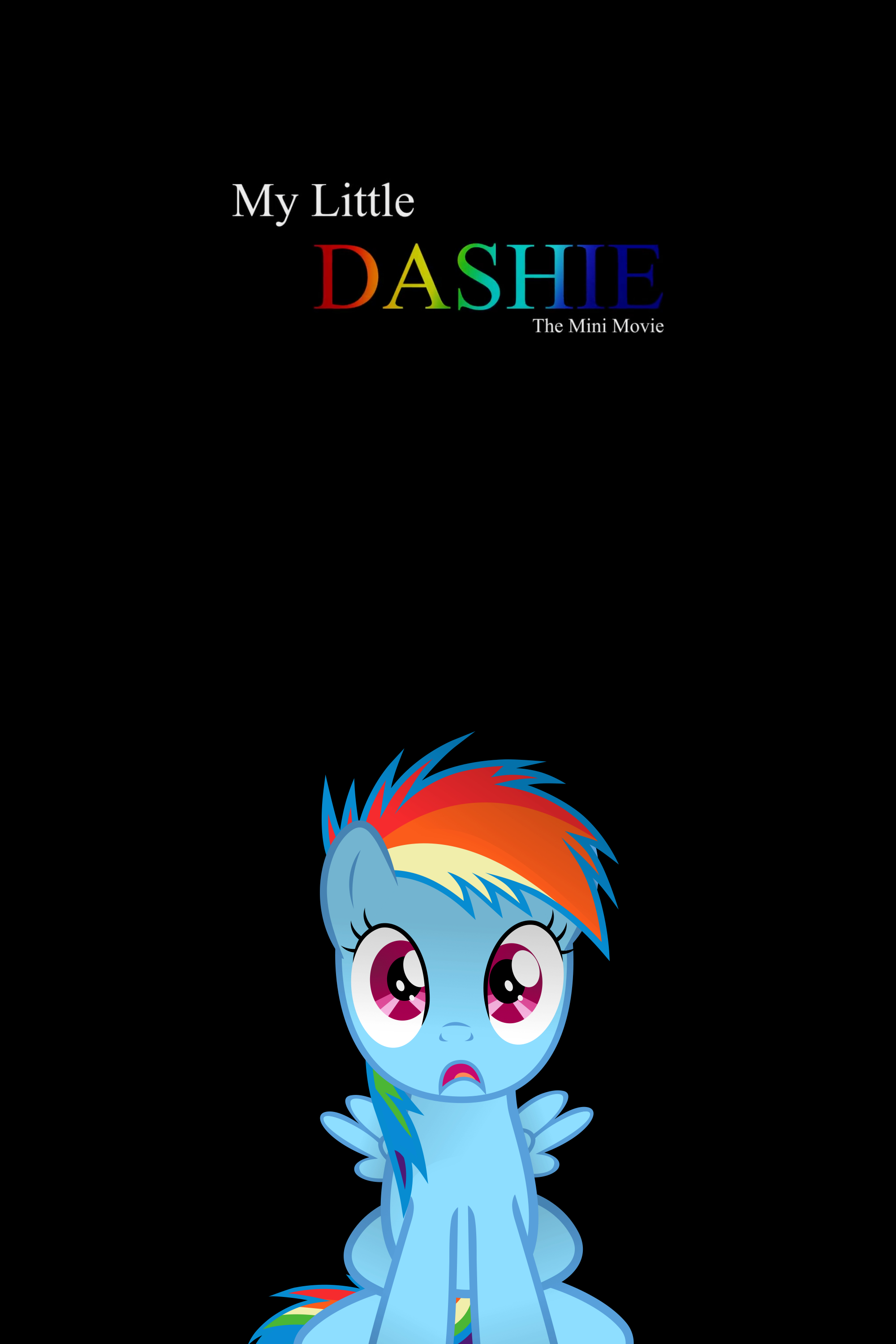
The entire poster (which i can only assume this is a poster design) has a dark theme to it, and everything is either toned down or entirely black.
The background being entirely black is not a good thing when what you have in the foreground is so simple, and so striking.
I suggest toning down RD vector in the foreground, and adding another one in the background. The one in the background should be barely visible, and a close up of just her face, maybe portraying a different emotion for diversity, or just exaggerating the shock by adding tears to the mix.
The rainbow text isn’t exactly original, but works, aside from the fact that you can’t see the name at all from far away, you should either tone it up a bit, or add some sort of outline to make it stand out.
that’s all i can think of now and waste my time on. have a nice day and hopefully you’ll learn something from this :3