[SFW] Artist's Group Chat

saby
Pixel Perfection - I still call her Lightning Bolt
Solar Supporter - Fought against the New Lunar Republic rebellion on the side of the Solar Deity (April Fools 2023).
An Artist Who Rocks - 100+ images under their artist tag
King Sombra - Celebrated the 10th anniversary of The Crystal Empire!
A Lovely Nightmare Night - Celebrated the 12th anniversary of MLP:FIM!
A Perfectly Normal Pony - Red is Sprout, yellow is Hitch, you are a lout, and also a bitch.
Speaking Fancy - Badge given to members that help with translations
Tree of Harmony - Drew someone's OC for the 2022 Community Collab
Elements of Harmony - Had an OC in the 2022 Community Collab
Non-Fungible Trixie -

Moderator
extra fun at parties
@40kponyguy  
For most areas (i.e. any that don’t benefit from an actual long grain) it’s better to do overlapping curly squigglies, or to follow a patchy hatching pattern.
 
As for balloons, if there’s any translucency, the colour would be stronger towards the edges of the shape, due to the angle of the surface getting more and more parallel with the viewer’s eyeline, hence absorbing more light, hence being less translucent, than the more perpendicular surfaces of the parts towards the middle. And due to how a balloon is produced, the colour would be stronger at the bottom and top, especially if it’s not filled near absolute capacity.
40kponyguy
Shimmering Smile - Celebrated the 10th anniversary of Equestria Girls!
Crystal Roseluck - Had their OC in the 2023 Derpibooru Collab.
Flower Trio - Helped others get their OC into the 2023 Derpibooru Collab.
King Sombra - Celebrated the 10th anniversary of The Crystal Empire!
A Lovely Nightmare Night - Celebrated the 12th anniversary of MLP:FIM!
Princess of Love - Extra special version for those who participated in the Canterlot Wedding 10th anniversary event by contributing art.
Tree of Harmony - Drew someone's OC for the 2022 Community Collab
Elements of Harmony - Had an OC in the 2022 Community Collab
Kinship Through Differences - Celebrated the 11th anniversary of MLP:FIM!
Verified Pegasus - Show us your gorgeous wings!

AimingToPlease,OftenMiss
@saby  
I think I just didn’t spend long enough coloring her,(around 10 minutes from line drawing to full colour), although your points about the balloons are good advice. I’ll try to remember that, thank you.
40kponyguy
Shimmering Smile - Celebrated the 10th anniversary of Equestria Girls!
Crystal Roseluck - Had their OC in the 2023 Derpibooru Collab.
Flower Trio - Helped others get their OC into the 2023 Derpibooru Collab.
King Sombra - Celebrated the 10th anniversary of The Crystal Empire!
A Lovely Nightmare Night - Celebrated the 12th anniversary of MLP:FIM!
Princess of Love - Extra special version for those who participated in the Canterlot Wedding 10th anniversary event by contributing art.
Tree of Harmony - Drew someone's OC for the 2022 Community Collab
Elements of Harmony - Had an OC in the 2022 Community Collab
Kinship Through Differences - Celebrated the 11th anniversary of MLP:FIM!
Verified Pegasus - Show us your gorgeous wings!

AimingToPlease,OftenMiss
@Panko Pai  
I think either the gem obsessed dress horse or the bendy pegasus background pony is going to be my next addition.
 
Haven’t decided on a pose for appul pone yet though.
Background Pony #EF63
Who wants to hear about my newest OC, Galactic.
 
Don’t worry, this is just to tell. I’m not asking for anything
Background Pony #EF63
@tehwatever  
This OC is more powerful than you can imagine. She’s so powerful that it’s impossible to make a different OC more OP than she is, and I’m not exaggerating.
 
Any and all powers that you can think of, no matter how crazy and unrealistic they are, she can use
Soobel
Solar Supporter - Fought against the New Lunar Republic rebellion on the side of the Solar Deity (April Fools 2023).
A Lovely Nightmare Night - Celebrated the 12th anniversary of MLP:FIM!
An Artist Who Rocks - 100+ images under their artist tag
Twinkling Balloon - Took part in the 2021 community collab.
Ten years of changes - Celebrated the 10th anniversary of MLP:FiM!
Artist -

more amore best amore
If its right place for asking advices to improve…  
Seems like i have serious issues about faces, eyes and facial impressions. Im used that people dont like or care very much of my pics but if i upload some closeup, they start to smash minus tag.  
Example: >>2535630 (merged)  
And i have no idea, whats wrong, i have read some advices not long time ago, tried to improve pics and reupload it again but usually it ends with more minuses and takedown.  
Seems its not about them weight, there are loads of immobile blobs what are ten times bigger, have 3-digits score and far more minuses.
saby
Pixel Perfection - I still call her Lightning Bolt
Solar Supporter - Fought against the New Lunar Republic rebellion on the side of the Solar Deity (April Fools 2023).
An Artist Who Rocks - 100+ images under their artist tag
King Sombra - Celebrated the 10th anniversary of The Crystal Empire!
A Lovely Nightmare Night - Celebrated the 12th anniversary of MLP:FIM!
A Perfectly Normal Pony - Red is Sprout, yellow is Hitch, you are a lout, and also a bitch.
Speaking Fancy - Badge given to members that help with translations
Tree of Harmony - Drew someone's OC for the 2022 Community Collab
Elements of Harmony - Had an OC in the 2022 Community Collab
Non-Fungible Trixie -

Moderator
extra fun at parties
@Soobel  
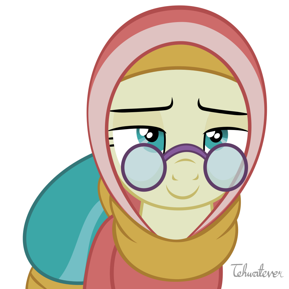
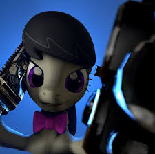
My biggest issue is the glassy, expressionless eyes rather close to each other and with the stiff eyelashes. The mouth also looks expressionless, but doesn’t bother me nearly as much.
 
More generally, there’s some issues with consistency. Whenever you take a heavily simplified style towards realism, the balance of detail is very delicate. It’s easy to get carried away with rendering, but if your form reads as a cartoon and your rendering reads as a “real thing”, the results can be horrifying. Just look at any of the photorealistic versions of Spongebob, Homer Simpson, and so on. Those are extreme examples of course, the problems here are much subtler. But the ears and the nose are rather cartoony in their form, whereas the mouth and eye areas are highly detailed and quite realistic. The eyes especially take a big leap towards the realistic size and form from the cartoon.
 
As for the jaw, I see no problem besides the fact that horses don’t carry fat on their heads, so combining a big fat jaw with a dainty little muzzle and rendering it so realistically reminds me of a pig’s head. Essentially it’s another conflict between the realism levels of rendering and form.
 
And another thing. The mouth is full of blood vessels right in the surface. If you make this area low ssaturation, it’ll look dead. This is ery close to the precise colour of a cow’s tongue in a butcher’s shop.
 
Aside from the uncanny valley stuff, I noticed your thing doesn’t really use the entire value range. I was zooming in to do edits and noticed all this work that you put into shading and texture, but it doesn’t read at all in the picture because the contrast is so narrow. Apart from single things in the background and the eye highlights, everything in here resides in middle values. Even your shadows are middle values. This doesn’t only eat away the detail, it makes edges round and makes the image look flatter than it would be.
 
/edit sorry for the lack of actual advice, I’ll post that part later
Interested in advertising on Derpibooru? Click here for information!
Champions of Equestria

Help fund the $15 daily operational cost of Derpibooru - support us financially!

Syntax quick reference: **bold** *italic* ||hide text|| `code` __underline__ ~~strike~~ ^sup^ %sub%

Detailed syntax guide