Uploaded by Burgerkiss 


")


1500x2080 JPG 903 kB
Interested in advertising on Derpibooru? Click here for information!
Help fund the $15 daily operational cost of Derpibooru - support us financially!
Description
Tags
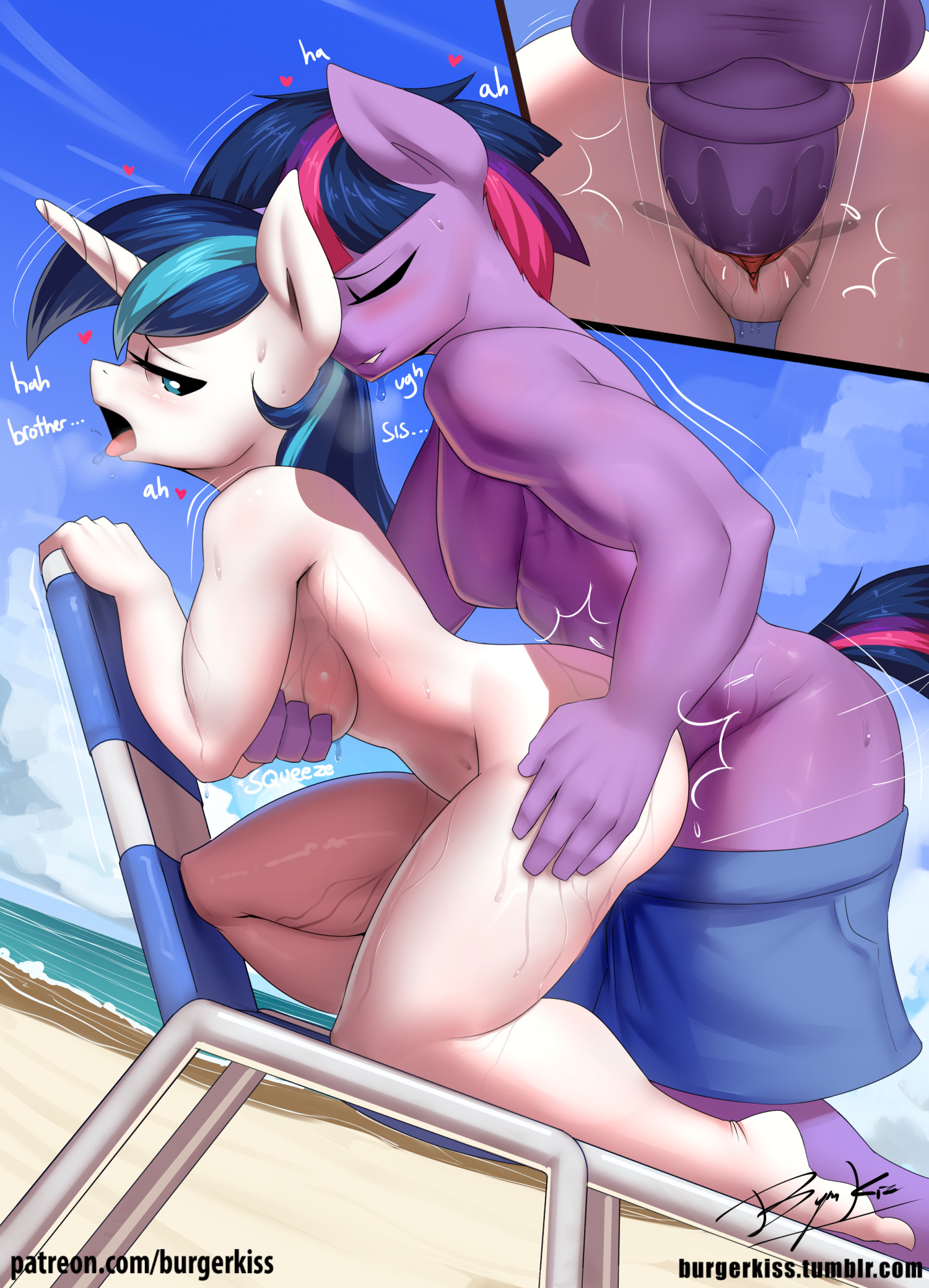
+-SH explicit473795 +-SH artist:burgerkiss512 +-SH shining armor28173 +-SH twilight sparkle358928 +-SH unicorn541094 +-SH anthro361283 +-SH plantigrade anthro51846 +-SH g42037892 +-SH balls110317 +-SH beach22201 +-SH beach chair1315 +-SH blushing275686 +-SH breast grab10095 +-SH breasts392923 +-SH breath2846 +-SH brother and sister6935 +-SH busty gleaming shield664 +-SH casual sex2125 +-SH chair11851 +-SH clothed male nude female1874 +-SH clothes637657 +-SH cloud43497 +-SH dialogue94301 +-SH doggy style10304 +-SH drool34799 +-SH dusk shine2743 +-SH exhibitionism13458 +-SH eyes closed139640 +-SH female1810875 +-SH from behind18517 +-SH gleaming shield1498 +-SH grope19395 +-SH hand on butt4310 +-SH heart77086 +-SH incest17984 +-SH infidelity10065 +-SH lidded eyes48404 +-SH looking back87041 +-SH male553281 +-SH mare746304 +-SH medial ring11925 +-SH moaning9488 +-SH motion lines1229 +-SH nudity514919 +-SH open mouth238993 +-SH outdoor sex3075 +-SH outdoors21978 +-SH panting3827 +-SH pants22542 +-SH pants down1423 +-SH penetration88967 +-SH penis214431 +-SH public nudity4752 +-SH public sex4732 +-SH rule 6333490 +-SH sand3598 +-SH sex172460 +-SH sex noises1252 +-SH sex on the beach611 +-SH ship:dusk shield20 +-SH ship:shiningsparkle1859 +-SH shipping255249 +-SH signature44709 +-SH sky23322 +-SH stallion196891 +-SH straight179935 +-SH sweat40848 +-SH tongue out147907 +-SH twicest1813 +-SH unicorn dusk shine91 +-SH vaginal57792 +-SH vaginal secretions53506 +-SH water25845 +-SH wet11744
Loading...
Loading...
You’re okay.
Ok, sorry. Just wanted to share my opinion. I’ll drop it now.
Let’s not go back to this, please? Thank you. :)
Edited
Well, the way I see it, people can like whatever they want to, and artists can create whatever they want to. I mean, this is a fanart site after all, it’s not like the artist is trying to be the next Van Gogh. Is there anything wrong with being cute, or being sexy? If the artist has a vision in mind, and they can pull it off relatively well, I’d call that a success. And I would still say that this is better than the “average” of the site. Ultimately, everyone is their own judge for quality, and it seems that a large number of people saw this and said “hey, I like this, I’ll favorite/upvote”, and I don’t see anything wrong with that.
The tables had turned
Judging from Gleaming’s expression, those aren’t the only thing.
But if you don’t like drawing guys, just do a version with Futa Twilight on Gleaming! Everyone can enjoy that. Either way, I love your work.
Edited
Hmmm its quite hard for me to see my own mistakes, especially for male drawings… (cuz tits and ass interest me more hehe)
Yes, maybe i should soften that part more in the future. and for referencing this position, i just use my Body-Kun toy here. I dont want to show the other boob of the male, so its a total side view.
Now that I observe it again, don’t you think Dusk Shine thigh and ass is bigger than Gleaming??? dang he’s thiccker
All I’m gonna say is we like what we like; we all have our fetishes. And we all have our opinions on the artists’ styles. That’s all.
Yeah, it’s a problem we partially tried to answer with our strictly safe ‘featured image’ display.
Anyhow. lets not drag this comment thread down this road. The topic should be the artwork above, not general site stuff. That belongs to the forums.
So back to topic please.
@Brony4Life
@Brony kaiju soldier
@kylebiddle
This goes for you too.
Edited
so what who gives a shit
Sheesh, aren’t you critical.
I agree.
Keeping in mind that I am not an artist, I did some basic paint shade matching to take out the black line, which suggests a fold- and also pointed out the specific part that looks inflated (red arrows).
The main problem I see with that line is that it draws attention to other, minor stuff like the fact that the pecs shouldn’t be a single unit (ie: Dusk has a mono-boob and should instead have two separate boobs). I don’t know if you use transparency layers when figuring out your positioning or just eyeball it, but it comes back to that line drawing the eye towards that section of the picture.
Edited
That’s nice, dear
I love the picture. But I can’t really tell what those two vertical lines are under Dusk’s right armpit. I can guess one of them must be his right shoulder section, but I don’t know which. Is the other one a scar? Or is the right scar-line the shoulder and the left line an elbow? Or is the left elbow-line the shoulder and that’s supposed to be a muscle?
Basically, all the areas around where Dusk’s nipples would be, I can’t tell what is happening there. What do those lines represent?
That being said, I love both pics, and hope to see more.
Calm down boy