Uploaded by Binkyt11 


 - Took part in the 2020 Community Collab")


 - Celebrated Derpibooru's seventh year anniversary with friends")


 - Celebrated Derpibooru's six year anniversary with friends.")


 - Celebrated Derpibooru's five year anniversary with friends.")

5000x2058 PNG 2.05 MB
Interested in advertising on Derpibooru? Click here for information!

Help fund the $15 daily operational cost of Derpibooru - support us financially!
Description
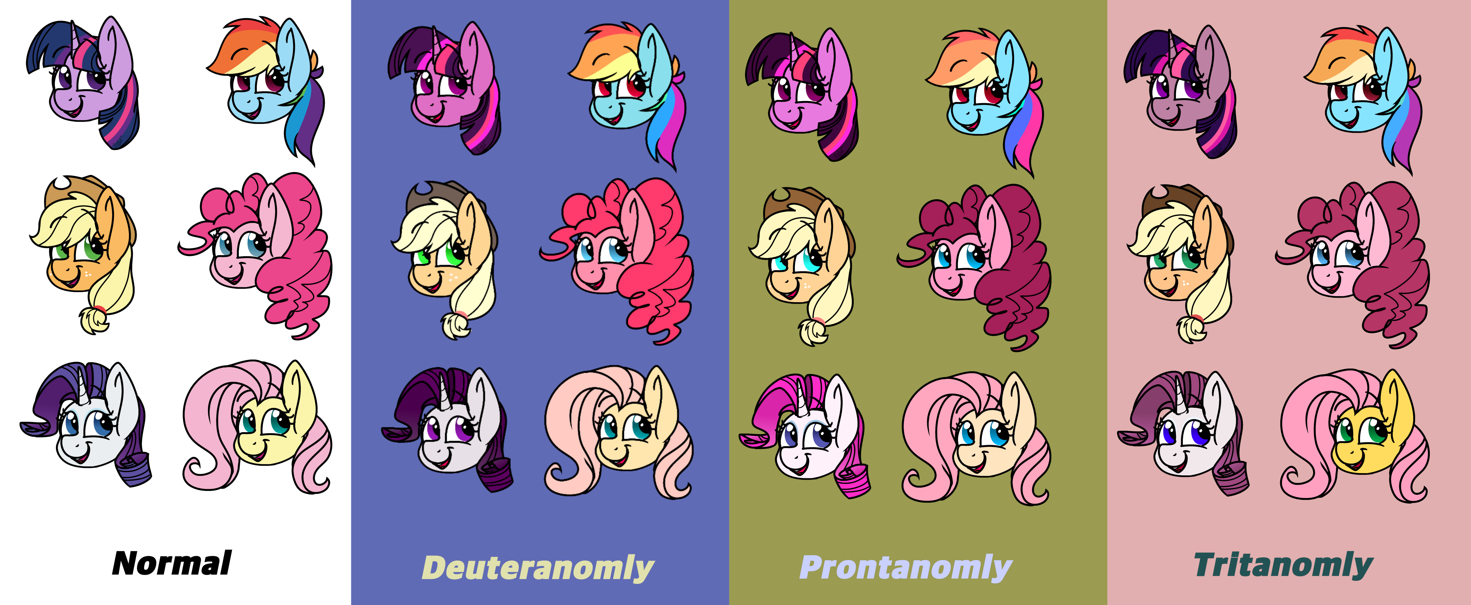
So, earlier today I wanted to find out how to get my Galaxy S5 to go into grayscale mode with out going into ultra-power-saving mode since they removed the latter as its own option a while back. I eventually did, but found other options. To my amazement, I found that they replaced what was shown on the phone with the lack of certain colors. Since this was under developer options, I can only assume it’s for people who are creating someone for the mobile market and at to see how some people with certain levels of colorblindness can view it.
So, naturally the first thing to come to mind was to draw. Or more specifically— color. With no quick look ups before hand, I simply colred them by memory with each option providing a unique filter to the wide array of colors I can see.
The whole experience was unique and gave me an closer insight as how people with these conditions view the colors of the world. Anyway, here’s Mt experience. Note: the names I am going by are only those was provided with. I did do some research on different types of colorblindness and found that these had different spellings.
Deuter/Prontanomaly:
The firsts one I did, theses one took the longest to get used to. I was only limited to only see mostly blue and Yellow here due to the lack of Red and Green for both. While initially similar, prontanomaly from what I’ve seen is the more severe of the two. While deuteranomaly does have the missing colors before very faded to a near gray color, prontanomaly was more confusing to follow since the colors were replaced with black and white, and the blue and yellow taking up most of the colors wheel/bar. As a result, the former often had me second guessing the colors, while the latter had me second guessing the both colors and color saturation.
Tritanomaly:
The easiest and most eye straining one of the group, this one had me working with red and cyan/blue. It felt a lot more natural to me, and even felt calming at times. However, the high contrast colors alone had me take several long breaks due to how straining it was to even look at. While I did have the same issue with prontanomaly, and the missing colors being practically black and white, the more familiar hues I was able to use quickly out weighed the issue. Since the colors were so high contrast, the colors here came out mostly dull looking. Regardless, I find this one to be the closest to the original.
Anyway, that’s all I have to say with my experiences here. I was planning on doing one for Total Monochrome, but I already had too many near corruptions on Tritanomaly’s.
Source
not provided yet
lol, pretty much. Ya can’t change perfection ya know. :p
AJ just gets contacts and a new hat :v